Project Title: YellowBox Branding & UX/UI Design
Category: Branding / Art Direction / UX/UI Design / Marketing Materials
Overview:
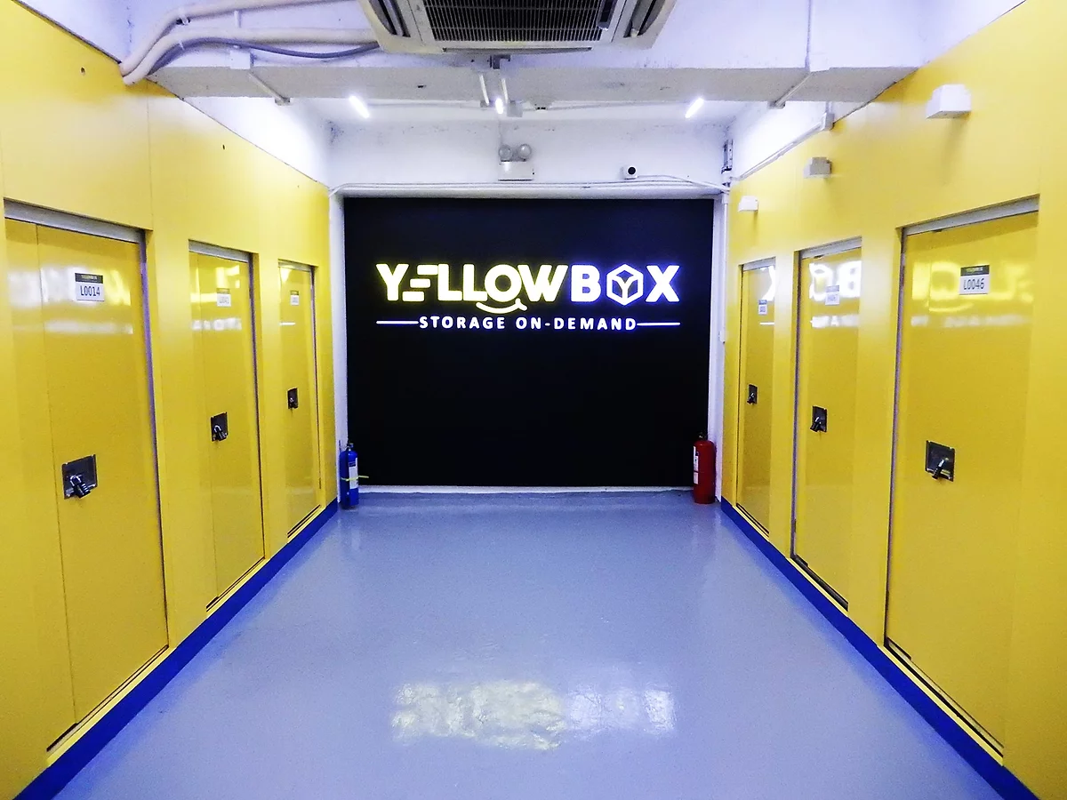
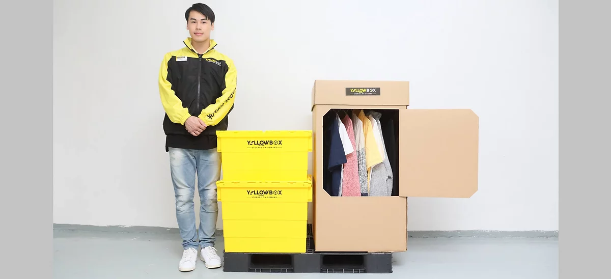
YellowBox is a new, innovative self-storage service from SC Storage, designed to provide flexible and convenient storage solutions to Hong Kong’s small-demand consumers. The service offers individual storage boxes delivered directly to customers’ doorsteps. As the Art Director for this project, I was tasked with developing a vibrant and youthful brand identity, creating an intuitive user experience across digital platforms, and designing eye-catching marketing materials to spread the word about this unique service.
The Challenge:
The challenge was to create a brand identity that stood out in a market crowded with traditional, often impersonal self-storage options. YellowBox needed to appeal to a younger, more dynamic demographic who values convenience, flexibility, and a modern approach to storage. This meant infusing the brand with energy, simplicity, and visual appeal while ensuring that the branding conveyed trust and reliability in the storage service itself.
Creative Solution:
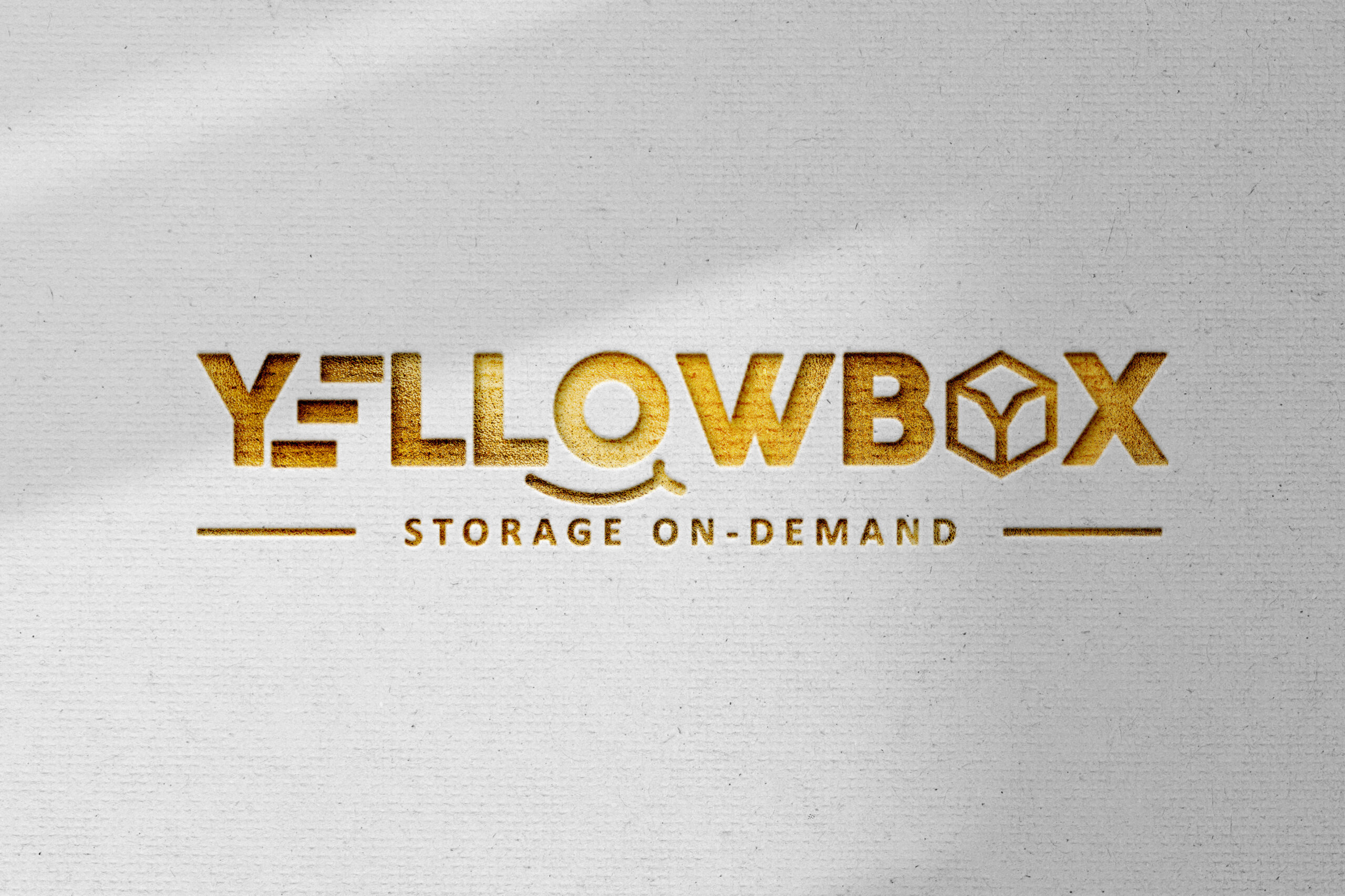
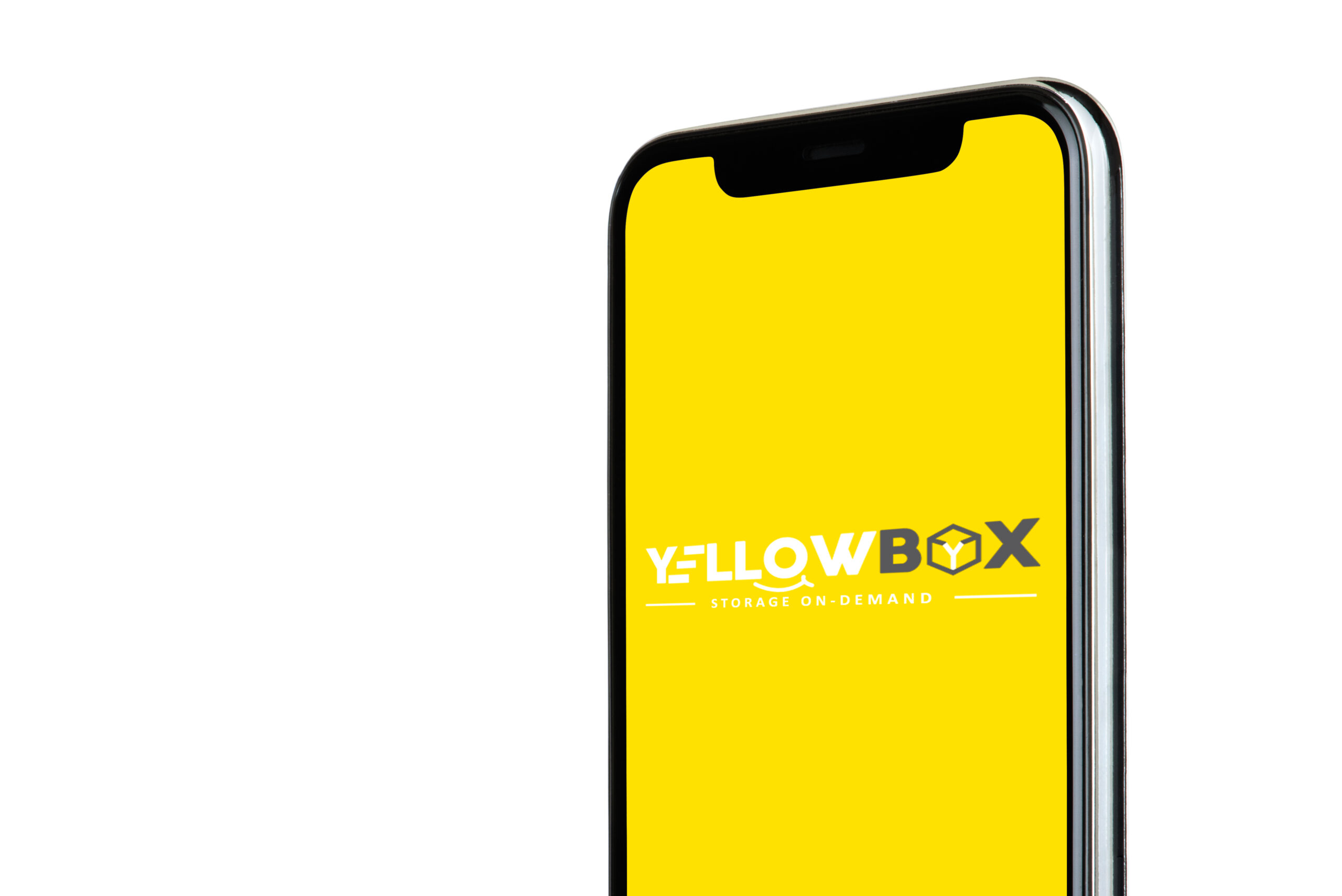
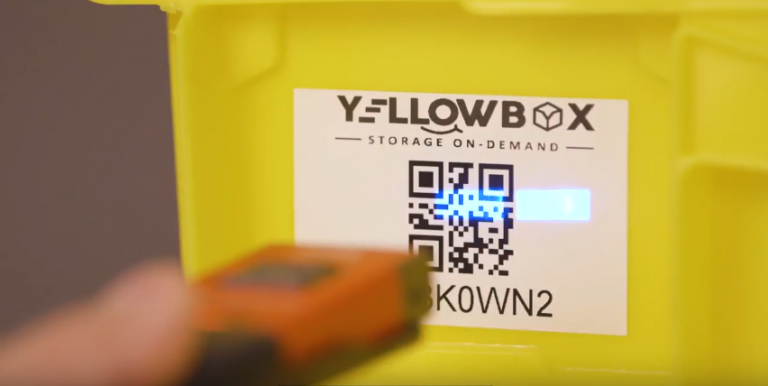
I centred the design around a vibrant yellow colour scheme, chosen to represent the brand’s core values of speed, energy, and happiness. Yellow is both eye-catching and memorable, making it the perfect foundation for YellowBox’s fresh and youthful brand identity. The logo was crafted to evoke a sense of motion and ease—two qualities that align with the convenience of having storage delivered right to your door. This logo combines playful typography with a simple, recognizable box element, representing both the physical storage solution and the sense of simplicity and accessibility.
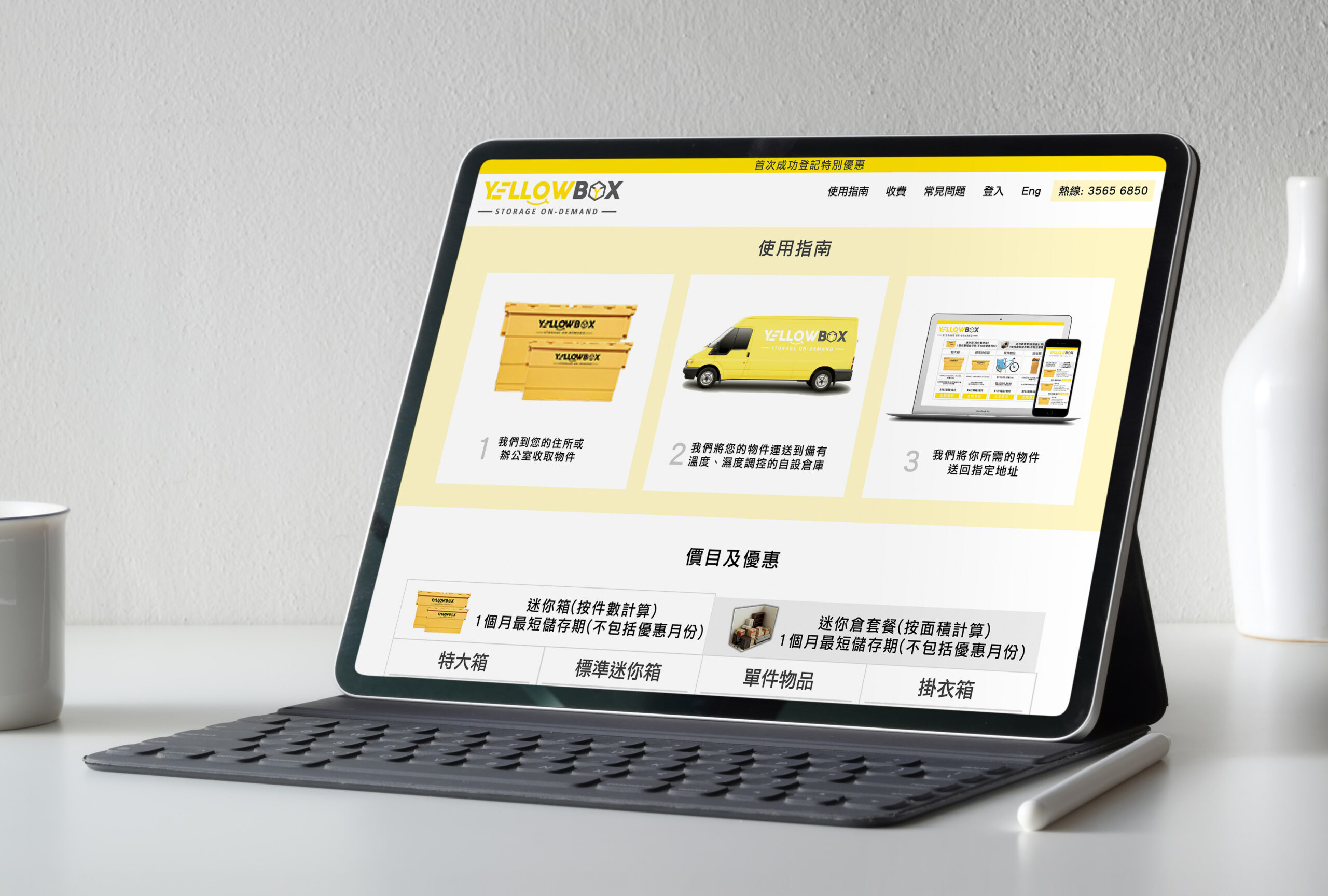
In terms of user experience, I focused on creating a clean, intuitive interface for the YellowBox website and mobile app. These platforms were designed with ease of use in mind, making it simple for customers to browse, order, and manage their storage needs. The app and website interfaces are intuitive and user-friendly, featuring clear call-to-action buttons, easy navigation, and a streamlined process for managing storage orders. This approach enhances customer satisfaction and emphasizes the brand’s promise of convenience.
For marketing materials, I designed bold and visually striking van wraps that promote YellowBox’s free delivery service. These van wraps act as moving advertisements, increasing brand visibility across Hong Kong. The bright yellow branding on the vans ensures maximum impact, spreading awareness about YellowBox’s unique storage service in a fun and approachable way.
Process & Execution:
- Brand Development: I began by researching the competitive landscape and identifying key differentiators for YellowBox. Drawing inspiration from SC Storage’s established brand, I crafted a new identity that was youthful and energetic while maintaining the professionalism of a trusted storage provider.
- Logo Design: The logo was designed with simplicity in mind, focusing on readability, versatility, and memorability. I used geometric shapes to keep the design clean and modern, with the box symbol representing the core service and the dynamic typography reflecting speed and convenience.
- UX/UI Design: The website and app were built with the user in mind. I focused on minimizing steps for customers, optimizing their experience from browsing to ordering. The design features large visuals, bright accents of yellow, and smooth transitions, ensuring a seamless digital experience.
- Van Wraps & Marketing Materials: The van wraps were designed to ensure high visibility on the roads of Hong Kong. Bright yellow backgrounds with minimal yet bold typography made the service instantly recognizable from a distance, capturing attention and increasing brand awareness.
Impact:
YellowBox’s fresh brand identity and user-friendly platforms have set it apart from traditional self-storage services in Hong Kong. The bright, youthful branding resonates with the target demographic, while the intuitive digital experience makes it easier for consumers to access storage when they need it. The van wraps have created increased visibility around Hong Kong, contributing to brand recognition and user growth.
Key Skills Demonstrated:
- Branding & Visual Identity Creation: Conceptualizing and designing a brand identity that reflects the company’s core values and appeals to its target audience.
- UX/UI Design: Creating a clean, intuitive, and responsive digital experience that enhances user engagement and simplifies the customer journey.
- Marketing Materials: Designing effective marketing collateral, such as van wraps, that increase brand exposure and generate interest.
- Art Direction: Led the creative direction of the project, ensuring consistency in all design elements, from the logo to the website and marketing materials.
Conclusion:
YellowBox is a perfect example of how art direction, branding, and UX/UI design can work in harmony to create a modern and memorable service offering. By focusing on user experience and crafting a vibrant, youthful identity, YellowBox has positioned itself as a leader in the self-storage industry in Hong Kong. With its innovative approach and strong visual presence, YellowBox is ready to redefine the self-storage experience.